Form has to carry the idea.
A strong silhouette makes an object recognizable. In identity work, I look for that same clarity in a mark, a type system or the overall shape of a composition.
A foundation in making. A perspective that carries into every medium.
Accessory design
Formal training in footwear, handbags and small leather goods.
These pieces are where the way I think as a designer becomes tangible. I designed and handcrafted each one, working across footwear, handbags and small leather goods.
My formal training in accessory design at Savannah College of Art and Design gave me a foundation in translating ideas into physical form. Engineered laser-cut patterning, hand stitching and trapunto connect graphic expression to the practical decisions that make an object hold together.
That foundation continues to inform my work in brand identity and creative direction. I consider how an idea behaves in different materials and at different scales, how its parts relate, and what someone experiences when they use it.
A letter can become a cutout. A fold can become the structure. A color choice changes when it moves from paper to leather. Making keeps those relationships visible and gives me a physical reference point for decisions I now make across brands, campaigns and environments.
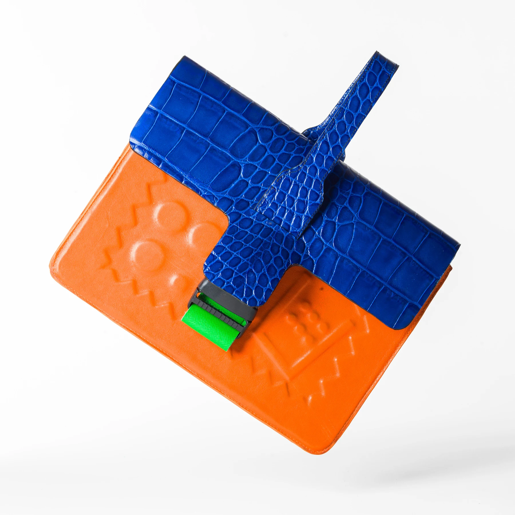
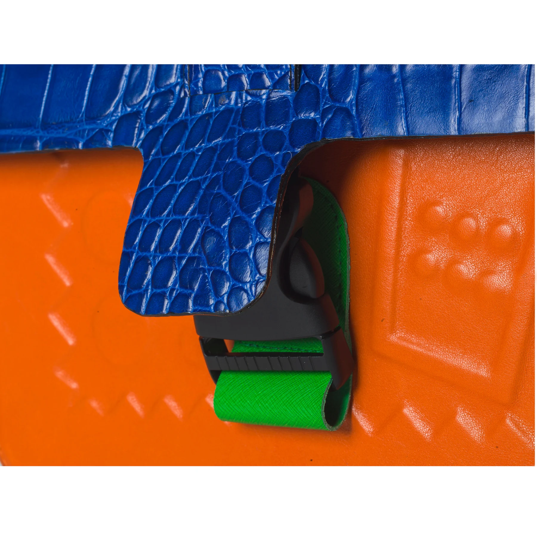
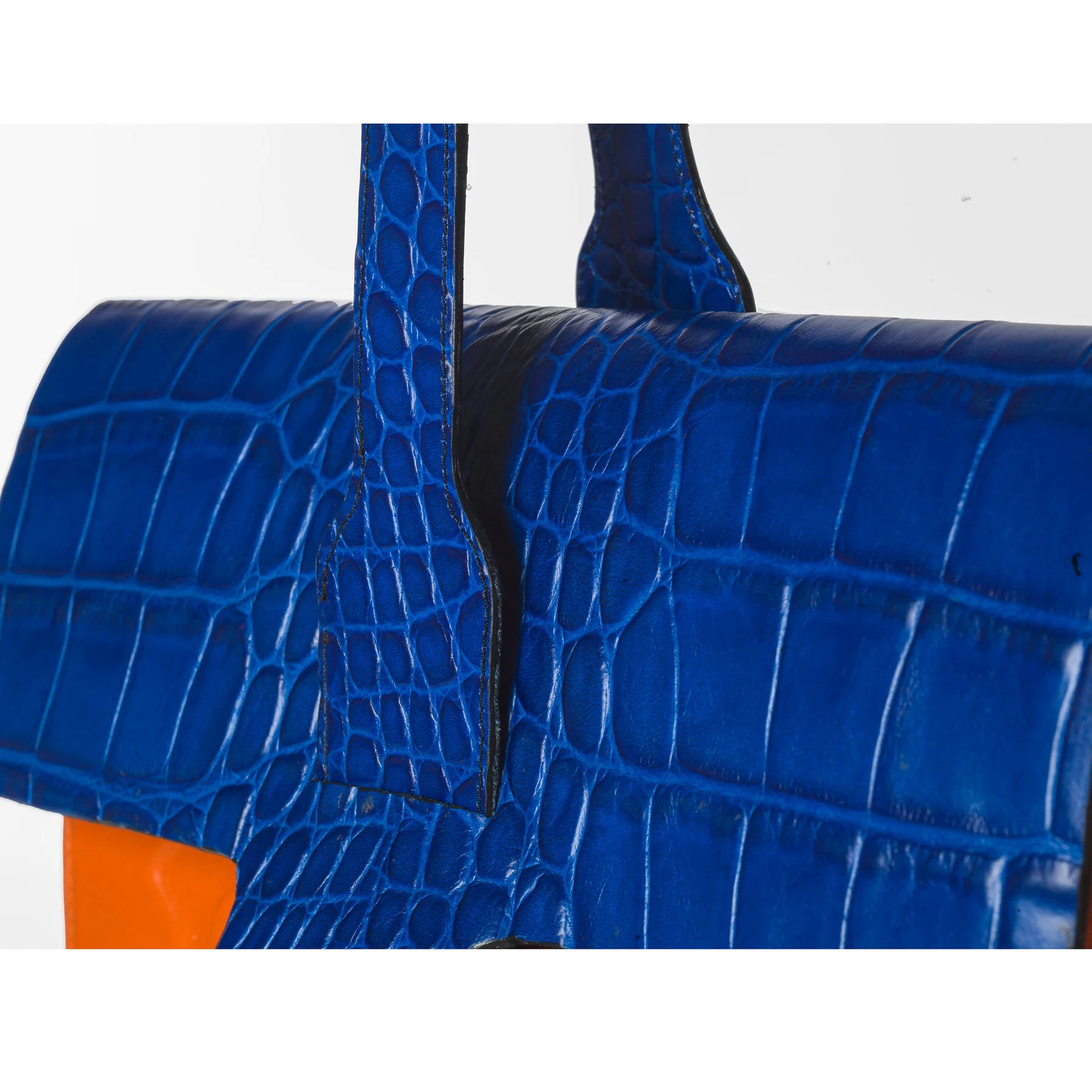
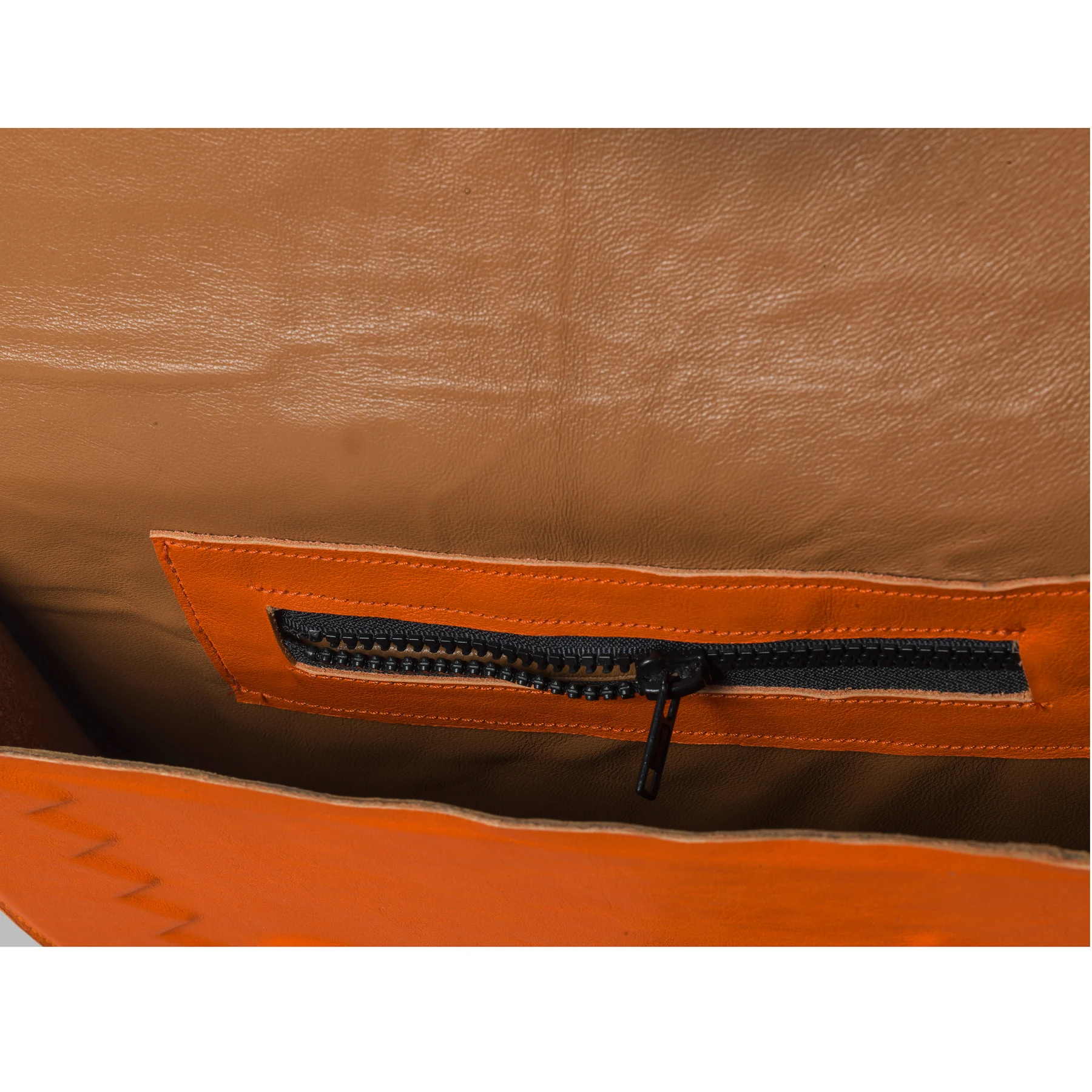
Inspired by Henri Matisse’s use of color and shape, this attaché combines blue crocodile-embossed leather, orange lambskin and a neon-green saffiano accent. Trapunto, a technique that gives the leather raised dimension, makes the surface part of the composition. The interior and handle details show how that expressive exterior is resolved as a usable object.
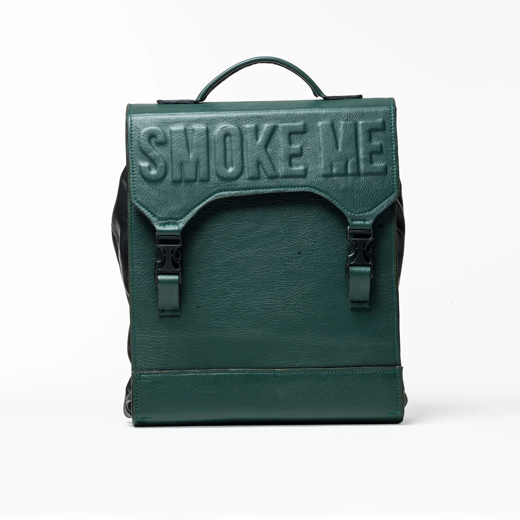
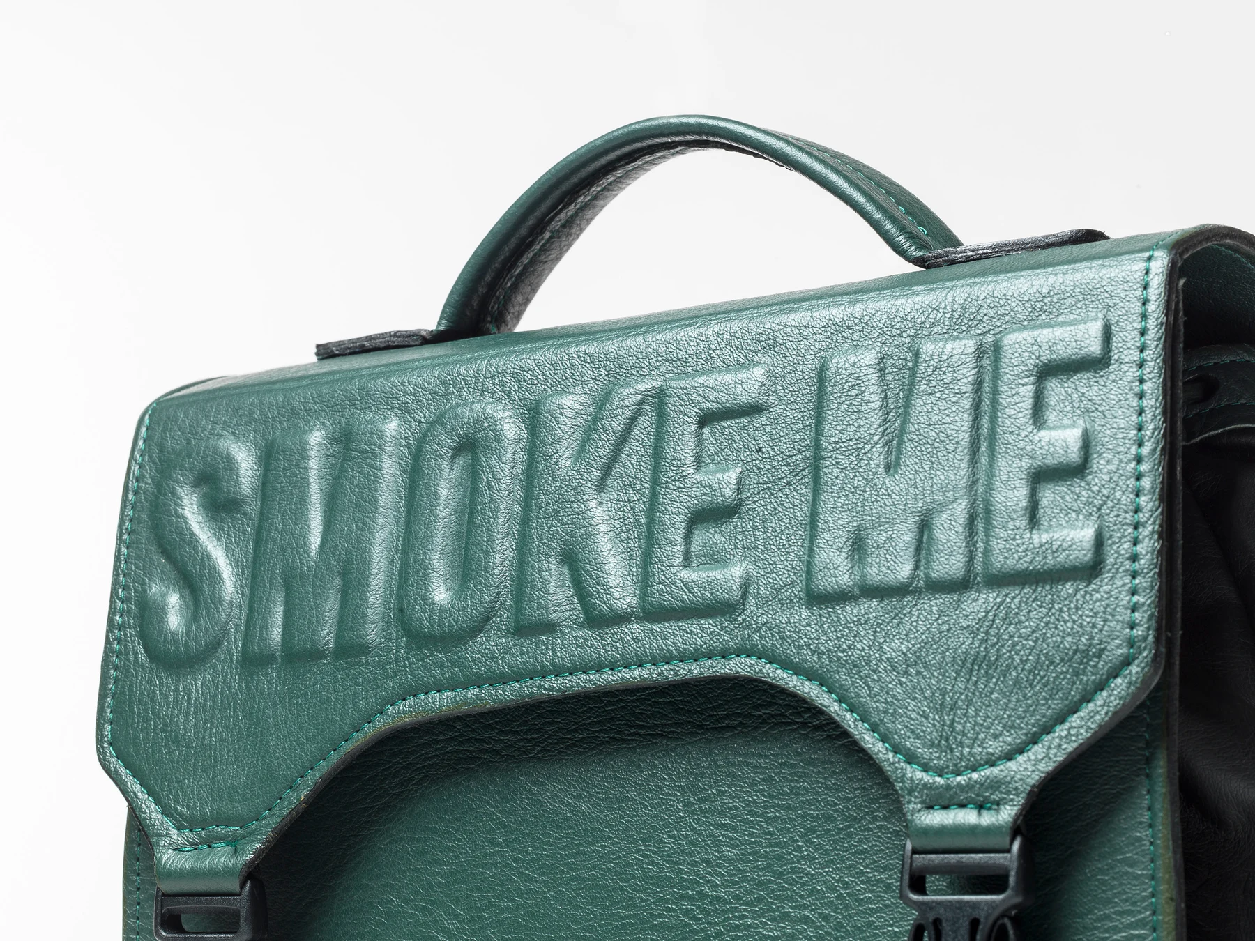
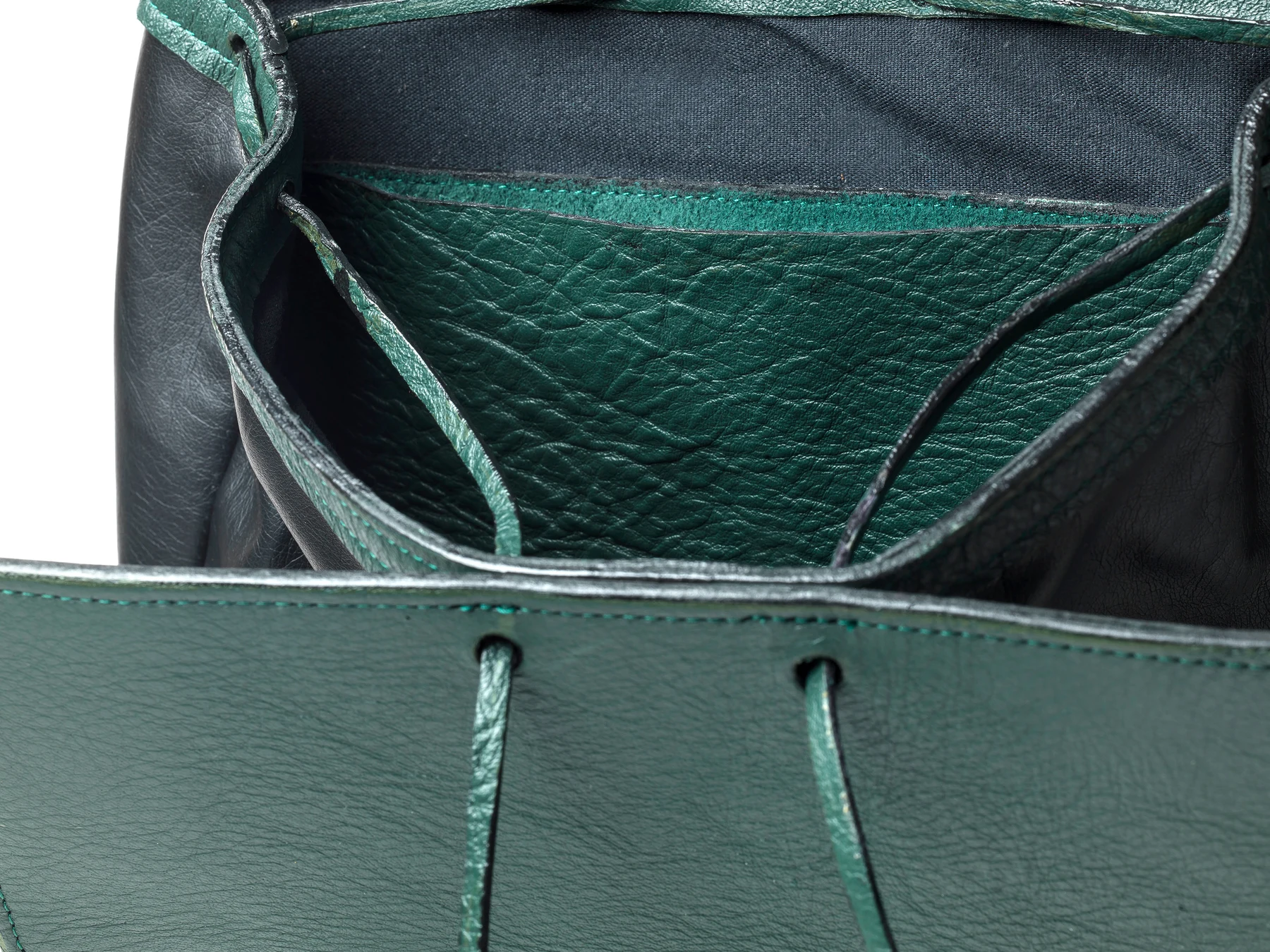
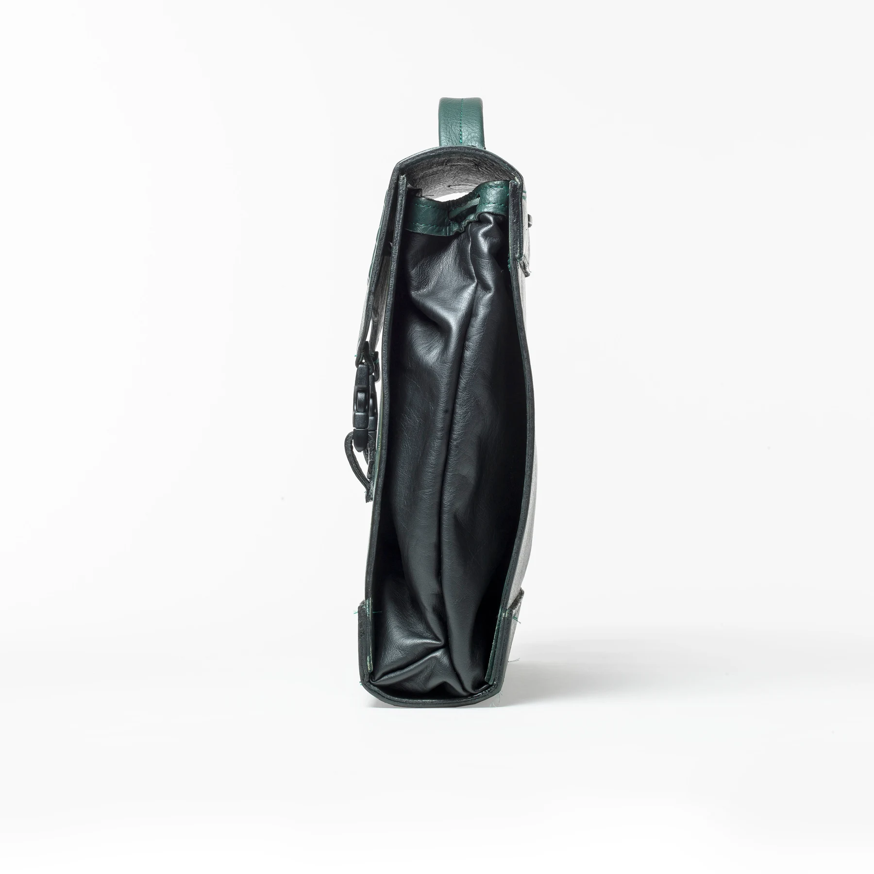
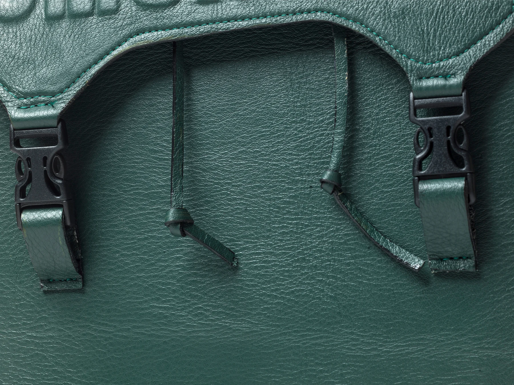
This piece combines a drawstring opening with a top handle, athletic buckles and leather ties. Hunter-green grainy cowhide contrasts with a black lambskin interior. The raised “Smoke Me” lettering nods to 1990s Nike and Spike Lee advertising. Here, typography is built into the material itself: the letterforms have volume, edges and a relationship to the bag’s structure.
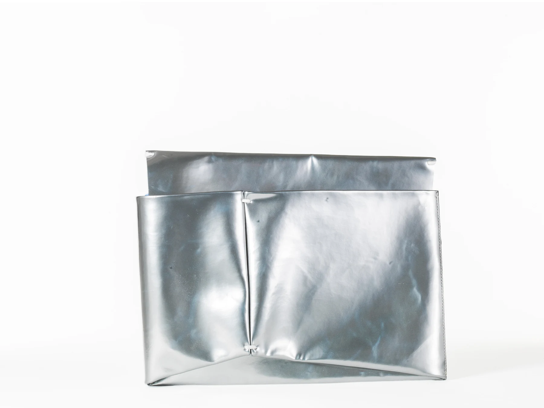
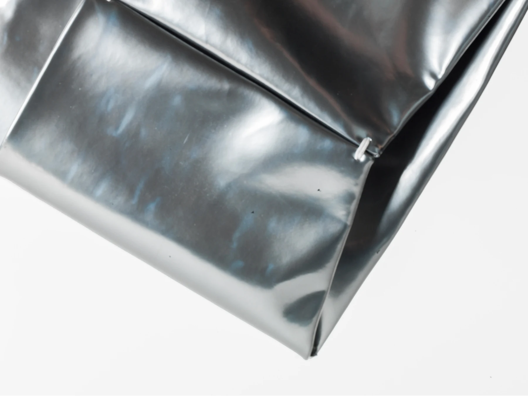
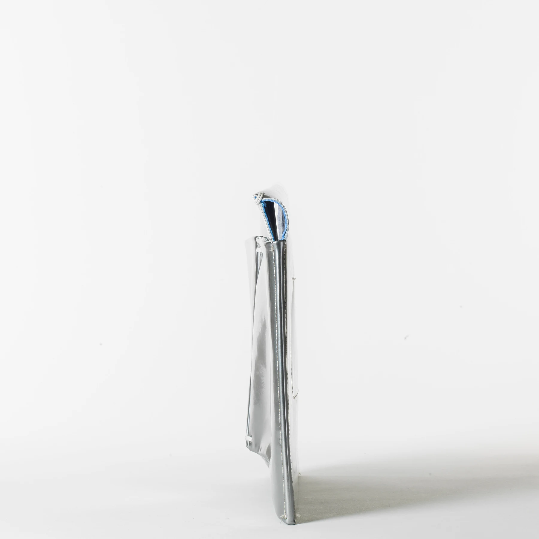
One piece of patent metallic leather and four hand stitches form this clutch. The fold carries both the shape and the construction, while the reflective surface makes every change of plane visible. It is an exercise in how much a single material can do when the geometry is resolved carefully.
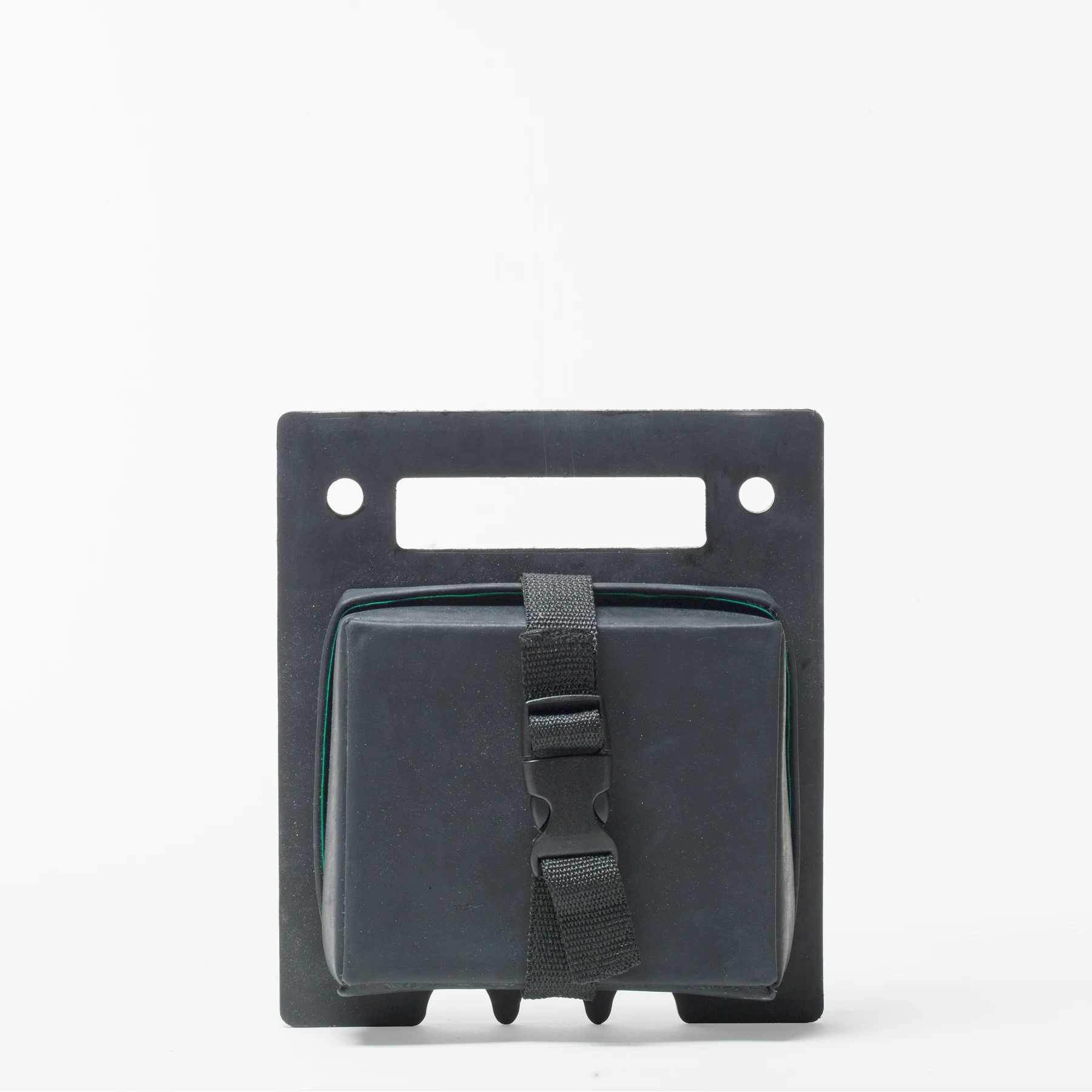
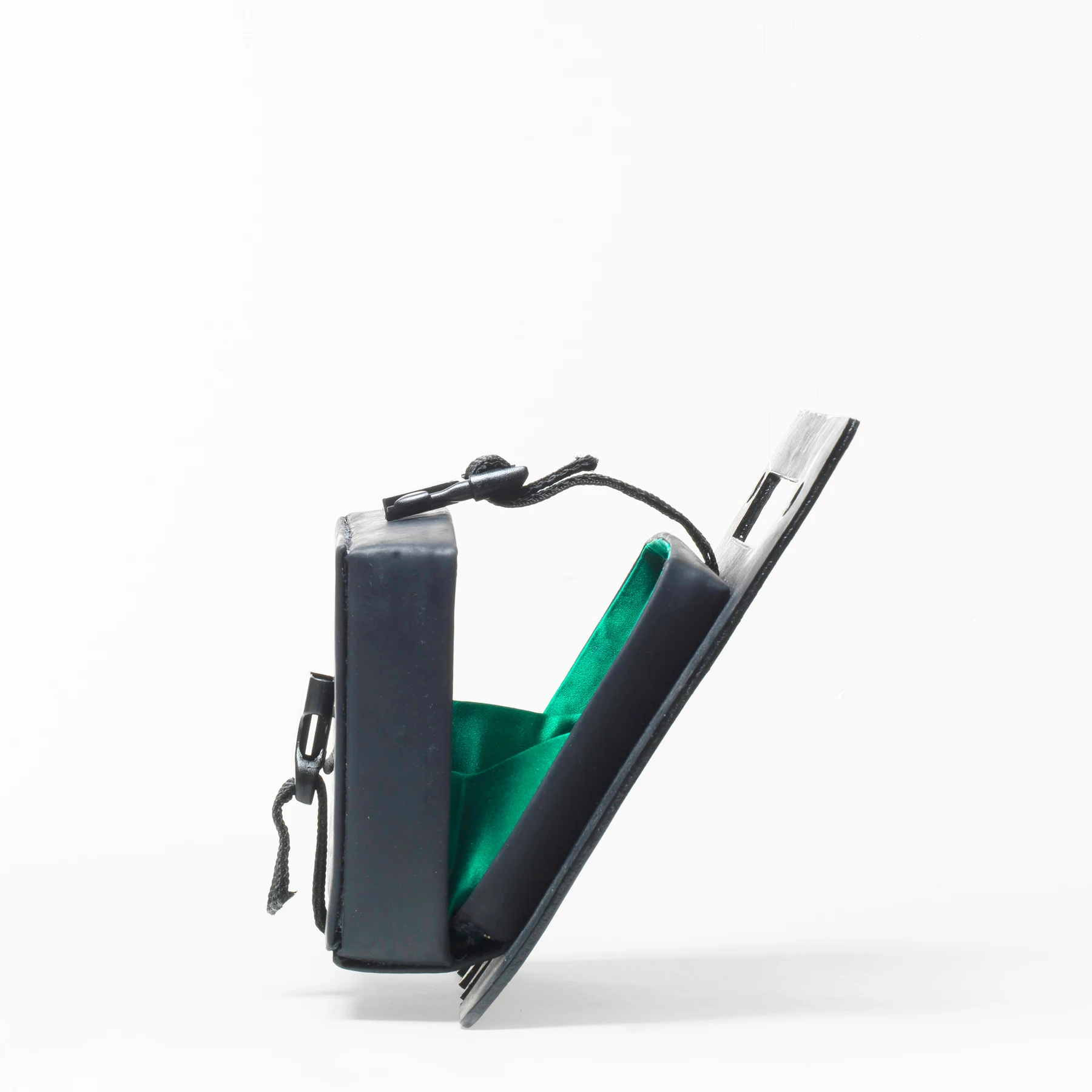
A compact box silhouette pairs an athletic buckle with an emerald satin lining. The laser-cut handle includes openings for a crossbody strap. The contrast between the exterior and the interior turns opening the bag into part of the design, while the handle brings carrying and construction into one detail.
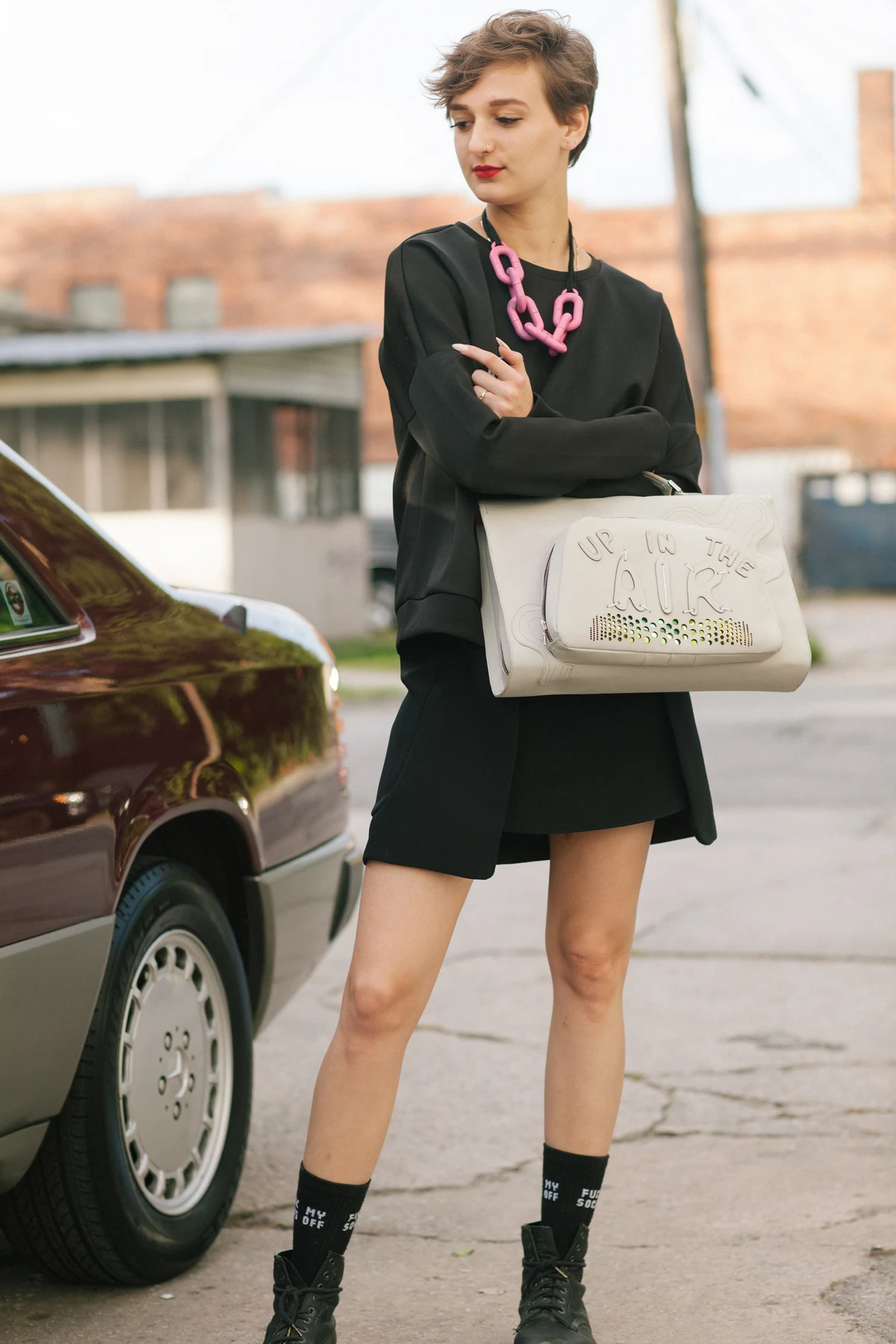
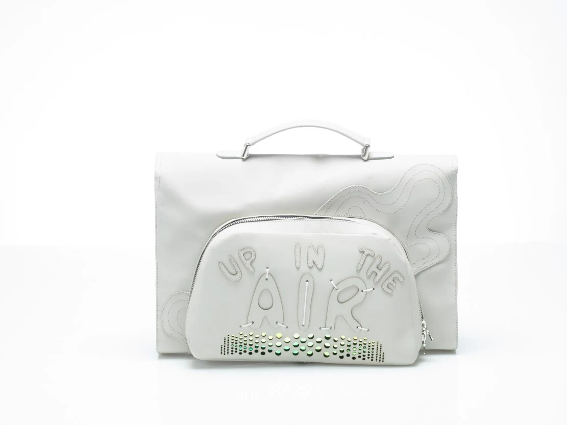
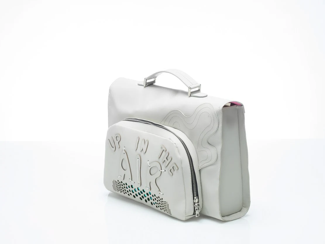
The familiar briefcase becomes a canvas for engineered laser-cut patterning, hand stitching and expressive lettering. “Up in the Air” is worked into the front pocket, giving a functional component its own graphic character. Studio and on-body views show the relationship between the surface detail and the overall proportion.
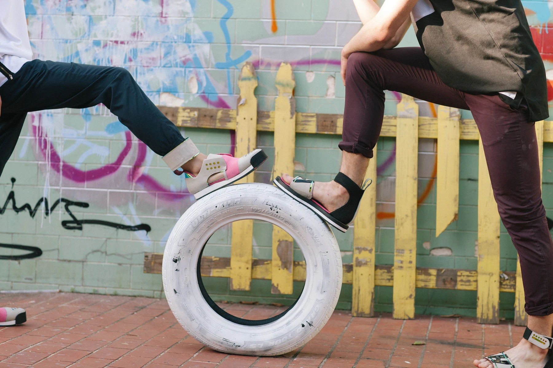
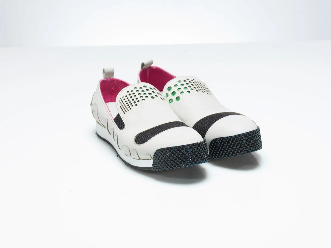
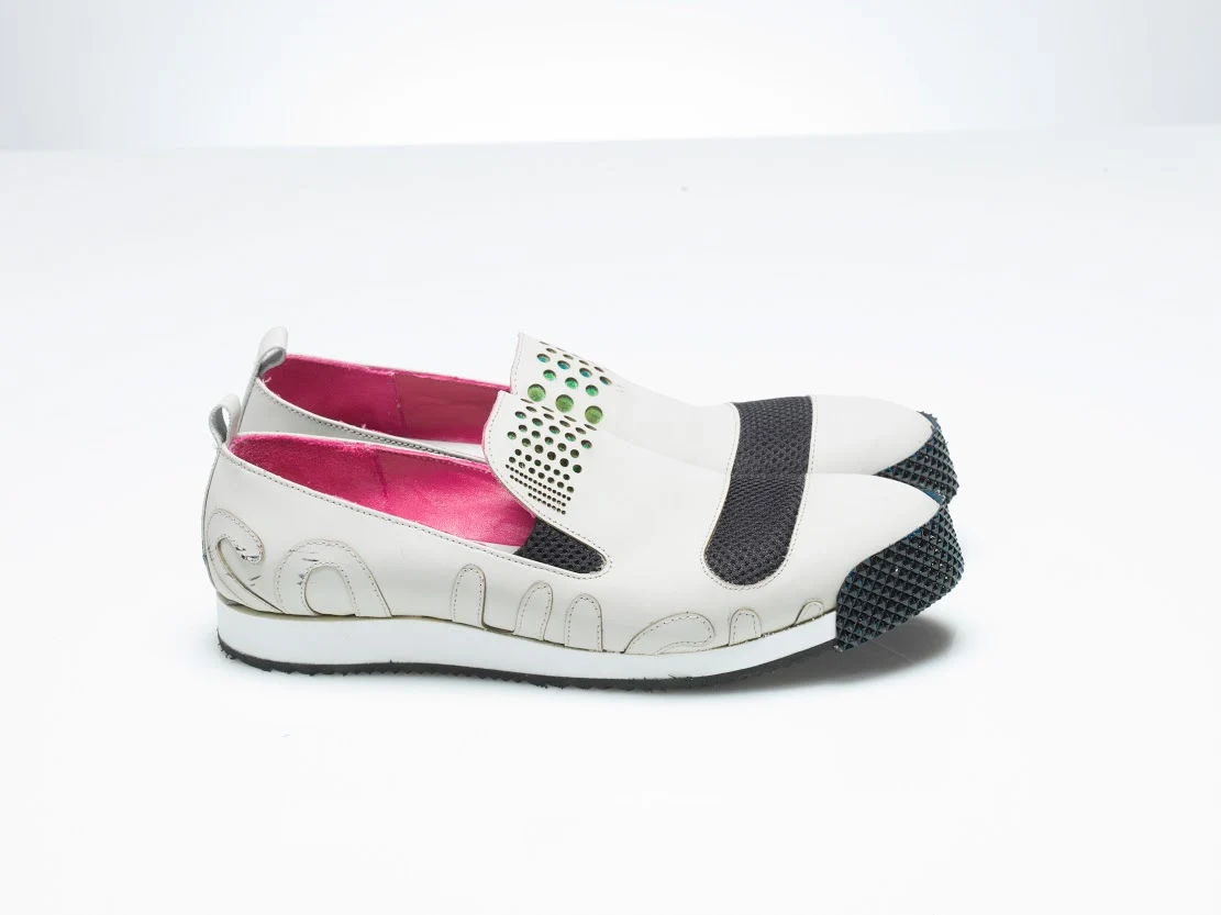
A loafer silhouette carries laser-cut lettering, mesh and holographic accents, with a vivid pink interior. The side view reveals how the graphic language follows the shape of the shoe. Perforation and contrasting panels give each part a distinct role within the whole.
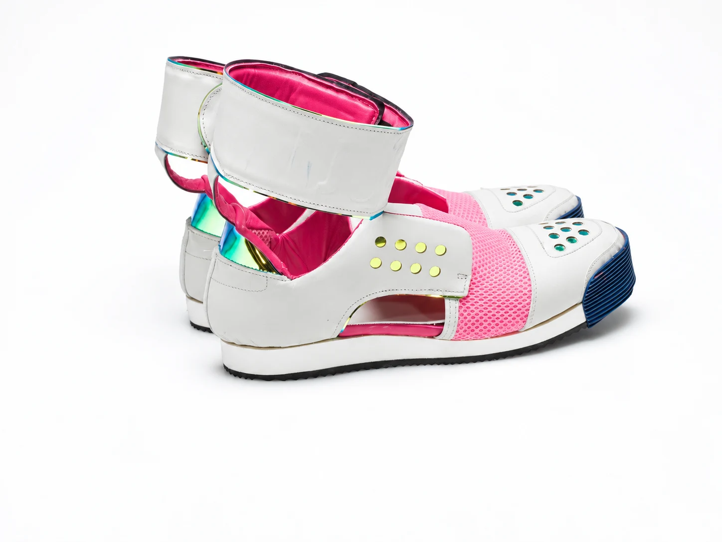
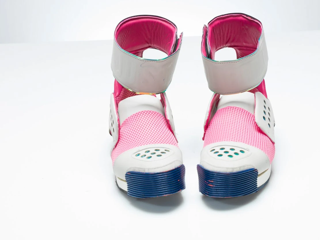
Ankle straps, rubber toe-cap splash guards and hot-pink lining give these hi-tops their character. Reflective accents and pink mesh create a shared material language with the other footwear. The front and side views reveal how those choices wrap around the form.
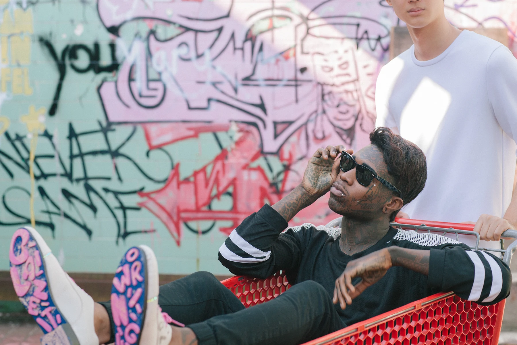
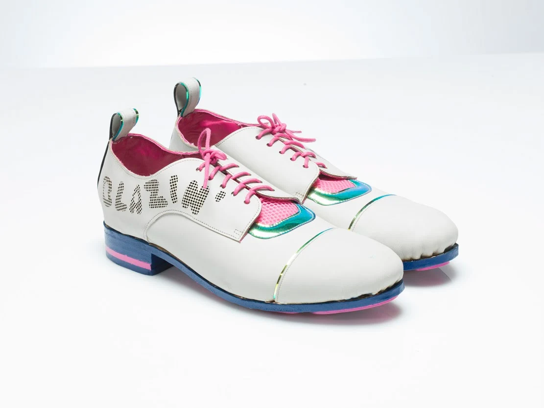
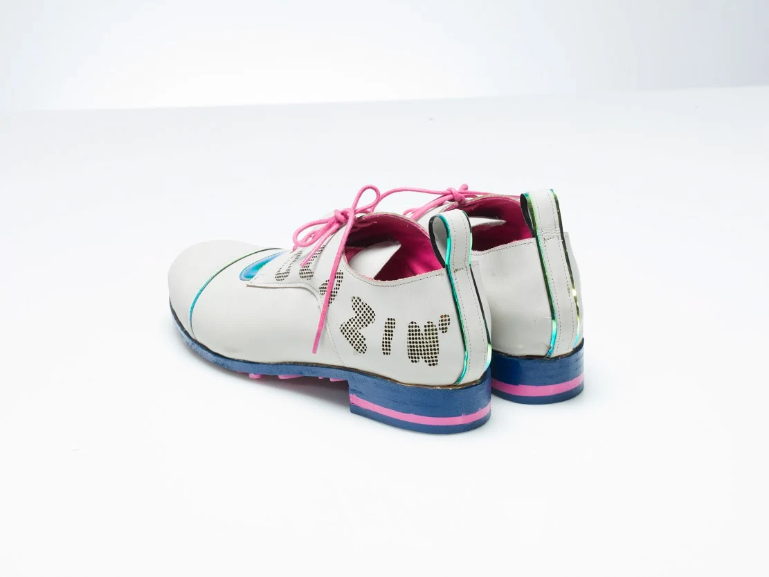
Precise, engineered laser-cut elements bring lettering into a lace-up derby. The “Blaze It or Wing It” treatment continues through the sole design, making the underside part of the visual story. It reflects an approach I still use: considering the less obvious surfaces as carefully as the first impression.
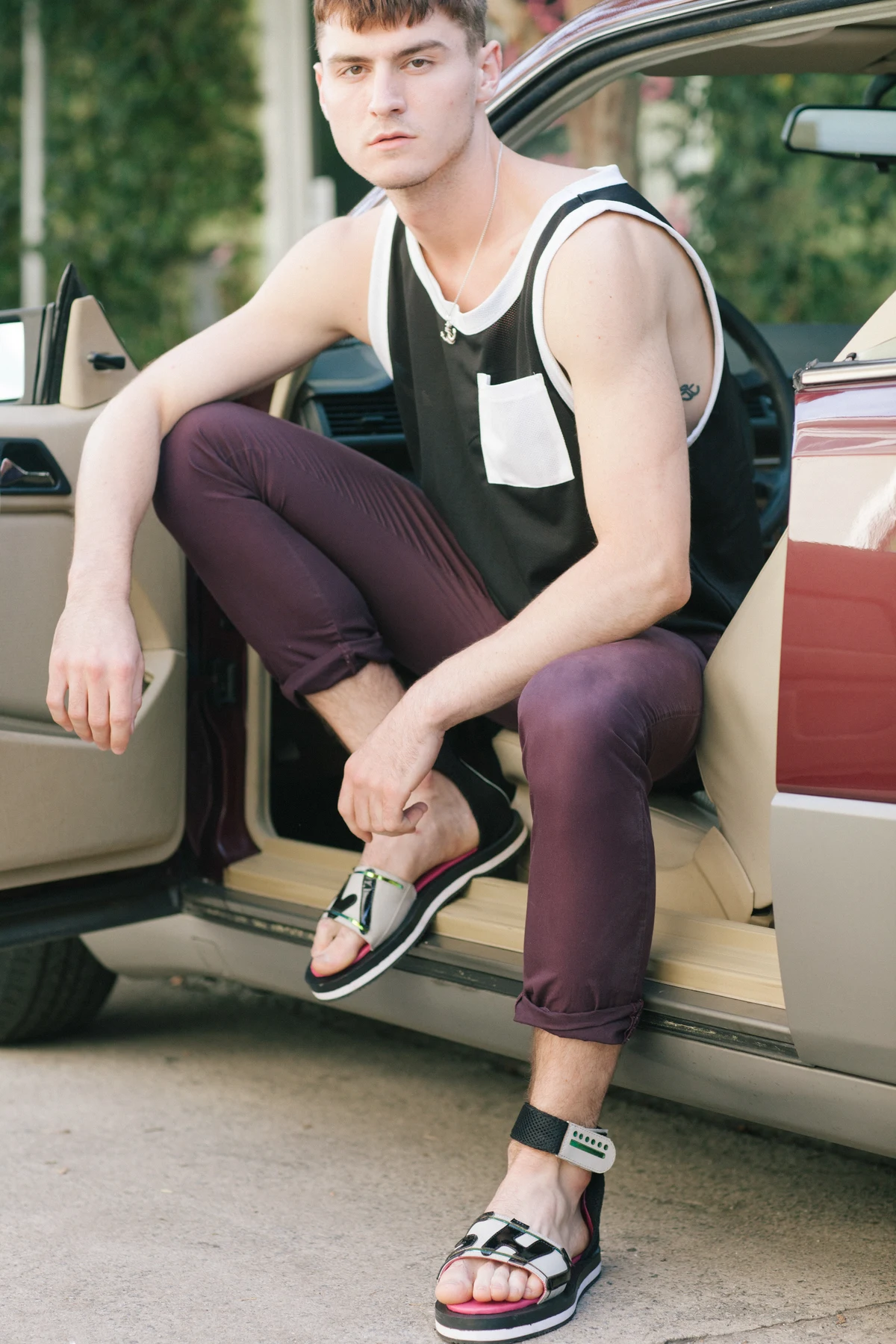
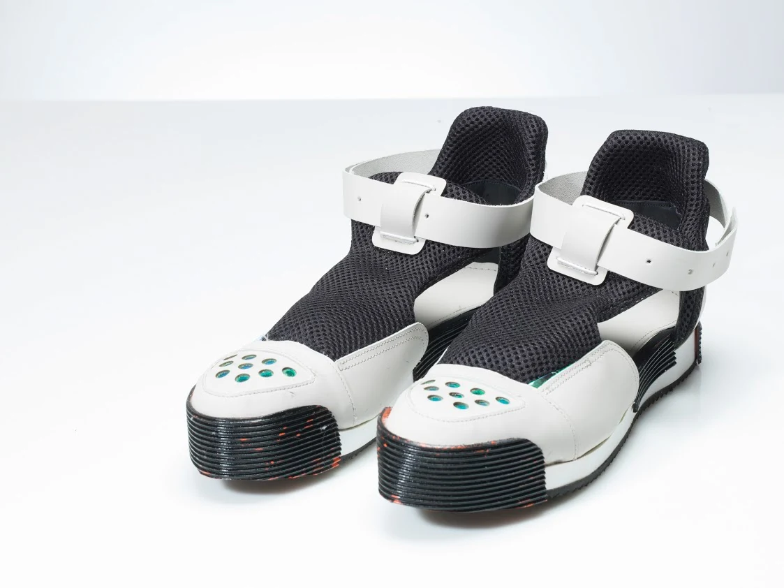
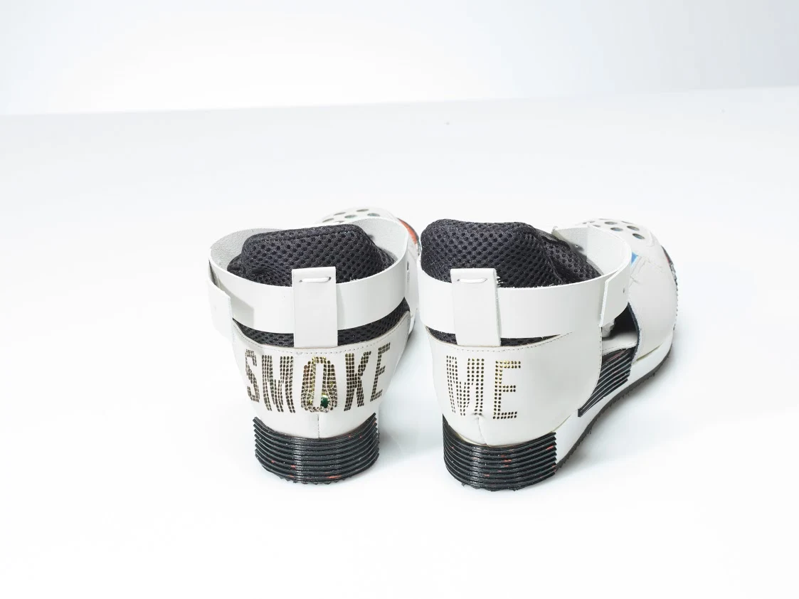
Adjustable ankle straps sit above a stacked sole, with holographic accents, black patent-leather lettering and a hot-pink insole. The platform gives the silhouette height, while the open construction exposes the layers and connections. The on-body photograph brings scale and styling into the study.
The medium has expanded, but these habits remain. I approach a brand system with the same attention I bring to a constructed object: a clear idea, a relationship between its parts, and care in how it is experienced.
A strong silhouette makes an object recognizable. In identity work, I look for that same clarity in a mark, a type system or the overall shape of a composition.
The cut lettering, linings and closures work together. That relationship informs how I build brands: individual decisions should reinforce a recognizable whole across applications.
A lining, a fold or a handle changes how an object feels in use. I bring that attention to the final expression of a design, from a printed piece to an environment or a screen.